Friday, 4 March 2016
Thursday, 3 March 2016
Blank - Final Cut
Reflective Comment:
It's done! Obviously we now need to work solely on evaluating and getting more feedback of the final one - perhaps showing it in assembly to the whole of Sixth Form if we're brave enough. Be me and Chloe are incredibly proud of this and feel it was a big learning curve for us both.
Wednesday, 2 March 2016
Tuesday, 1 March 2016
Sunday, 28 February 2016
OCR Specification
http://ocr.org.uk/images/81037-specification.pdf
'Appendix B: Marking Criteria for Unit G321: Foundation Portfolio in Media' starts at page 58.
'Appendix B: Marking Criteria for Unit G321: Foundation Portfolio in Media' starts at page 58.
Saturday, 27 February 2016
Sound for final OTS
Sounds used, and where they're used, in 'Blank':
Sounds Used In 'Blank':
We decided against Sardonicus as we felt it was too scary and too breaking of the Film Noir conventions. We also thought it didn't fit with the images shown and had a too disturbing feel when played. We were keen on Insidious for a long period of time but once we'd found Intimidation we felt that worked better and was easier to manipulate around the footage to make it feel scary.
The main parts of the backing music are Better Days and Intimidation mixed with House on the Hill. Better Days is from a website called BenSound. This is a copyright free website where you can search for ambient backing music by genre. Better Days is a calm piece of music with an occasional jazzy twang. This is the most Film Noir conventional piece of music we have in our project. Most of our scary music, that plays after the ident, is promotionally Intimidation, Thunder Rolls, Drones and House on the Hill. These create an up tempo, low pitched beat for it to be easier for the viewer to watch. We foley-ed a clank from when the pencil sharper blade moves, the light switch click, the door closing, and a finger click. We did also record these noises at the time of shooting the footage but they seemed muffled and unclear to we re-filmed them using a Marantz audio recorder whilst also recording Harry doing a voice over and letting the story unfold of what Harry will do in this film. a Marantz audio recorder is a good thing to use as the sound comes out clearly and they are also easy to use.
Chloe wrote the script for the voice over, it says:
I never thought I would have the bottle to commit murder, and take a vindictive, sly, suductive, women from this Earth but she betrayed me and I needed justice. So now I am left with all traces of her, that drill holes through my mind, traces I have to get rid of before I kill another. This time with no consequences. My future is nothing but a blank page.
Sounds Used In 'Blank':
- Better Days - BenSound.com (copyright free)
- Intimidation - Purple-Planet.com (copyright free)
- House on the Hill - Purple Planet.com
- Sweep Motion - Downloaded Online (copyright free)
- Thunder Roll - iMovie Sound Effects
- Drone Dark Suspense 2 - iMovie Sound Effects
- Ambient Effect 2 - iMovie Sound Effects
- Voiceover - Original (recorded on a marantz audio recorder)
- Door Close - Original (FOLEY)
- Light Switch - Original (FOLEY)
- Clank - Original (FOLEY)
We decided against Sardonicus as we felt it was too scary and too breaking of the Film Noir conventions. We also thought it didn't fit with the images shown and had a too disturbing feel when played. We were keen on Insidious for a long period of time but once we'd found Intimidation we felt that worked better and was easier to manipulate around the footage to make it feel scary.
The main parts of the backing music are Better Days and Intimidation mixed with House on the Hill. Better Days is from a website called BenSound. This is a copyright free website where you can search for ambient backing music by genre. Better Days is a calm piece of music with an occasional jazzy twang. This is the most Film Noir conventional piece of music we have in our project. Most of our scary music, that plays after the ident, is promotionally Intimidation, Thunder Rolls, Drones and House on the Hill. These create an up tempo, low pitched beat for it to be easier for the viewer to watch. We foley-ed a clank from when the pencil sharper blade moves, the light switch click, the door closing, and a finger click. We did also record these noises at the time of shooting the footage but they seemed muffled and unclear to we re-filmed them using a Marantz audio recorder whilst also recording Harry doing a voice over and letting the story unfold of what Harry will do in this film. a Marantz audio recorder is a good thing to use as the sound comes out clearly and they are also easy to use.
Chloe wrote the script for the voice over, it says:
I never thought I would have the bottle to commit murder, and take a vindictive, sly, suductive, women from this Earth but she betrayed me and I needed justice. So now I am left with all traces of her, that drill holes through my mind, traces I have to get rid of before I kill another. This time with no consequences. My future is nothing but a blank page.
Wednesday, 17 February 2016
The Ending ....or the Beginning?
As we have stated before, to fit with Film Noir conventions me and Chloe have chosen to have our opening title sequence (OTS) as the end of our film. However after the OTS has finished, the titles have been and the main credits have shown the actual story will begin. Me and Chloe have decided to add the first nine seconds of our story so that it feels more like an opening title sequence. To fit with Film Noir conventions we're starting with a traditional feature of this genre, smoke. It will fade in from the titles of Blank to the smoke rising. However although it will look like smoke and give that traditional Film Noir film straight away, it will actually be steam and this will become evident by the next scene being of a kettle. Kettles are often used to make hot drinks such as tea or coffee that people normally have with their breakfast so this will symbolise the beginning of the day fitting with the beginning of the film.
Previously on this blog, I've analysed Gone Girl (2014) opening title sequence. Gone Girl's OTS end with it stating the day and time, in this case it ends saying
'JULY 5TH
THE MORNING OF'
but does not state what it is the morning of, this adds suspense and confusion to the audience.

However me and Chloe did like the how it says the date and lets you know this is the beginning of the story for you to then follow chronologically. As we liked this and also where it was positioned we used this in our OTS.


Monday, 8 February 2016
Film Comany Idents Analysis
Film idents from Emily Ventress
Many film company and studio idents are based around the sky, predominately night time. However some, such as 5., 6. and 7. in the slideshare above, just base themselves around their logo with a plain background, this obviously makes the logo and name stand out more but I think makes them less memorable.
When showing people in order to get feedback recently, many of them have been mentioning how they dislike the ident (which was the first one). They didn't like how it's spelt out and we even recorded a member of our target audience saying this in .........
Therefore me and Chloe realised we needed to make something more professional using some more professional. I then downloaded the Adobe Creative Cloud trial and installed After Effects CC (2015) and Media Encoder CC (2015). Both me and Chloe have never used After Effects before and therefore we followed a YouTube tutorial into making the second ident in the video above. Although I liked it I thought now we'd leant the skills that I'd try make another and therefore made the third one. I really like this one and think it looks really professional. It took me about 2 full hours to make even thought it's only 4 seconds long.
Reflective Comment: I like the final ident a lot and am proud of our progression from the very iMovie generically made first ident of the stars. I also am happy we have used After Effects as that's provided experience and professionalism.
Friday, 5 February 2016
What Does This Say?
Reflective Comment: I think this was a really effective video. It was a quickly filmed vox pop of what my class thought the titles Chloe had made said. We found that only half got it right and that simply isn't enough for if it was mass shown half of the audience wouldn't even know what the film is called. We know from this quick survey that we need to re-think our titles and try again to create them.
Reflective Comment: This was another quickly filmed vox pop of what our friends and family thought the titles Chloe had written said. All got it write so we know they've improved since the last ones.
Sunday, 31 January 2016
Feedback
Reflective Comment: I like this video, it clearly shows Harry and Eleanor's views. They point out the parts they liked/disliked. We chose these two as they have experience with mine and Chloe's filming, they know the Film Noir genre and have excisiting knowledge of characters and camera angels due to their drama and performance studies A-Levels. However Harry was our actor in this as so could be bias and not being honest about what he really thought of the acting or scenes filmed. Also Eleanor and Harry are both mine and Chloe's friends and may have felt they needed to be nicer about the rough cut than they would've been if they didn't know us.
I have received positive feedback in the comments box on the YouTube video. This is always nice to receive and will take his comments on board.

Reflective Comment: This video is something I quickly made to show where me and Chloe are at with our production. Jack and Fabian made some good points that me and Chloe can work on and improve on and they also have knowledge of the brief and theme as they are in our A-Level Media Studies class. However, as this was filmed without their knowledge we wanted them to be as honest as they could and didn't want to prise answers out of them but I do feel we could've asked more questions to get more accurate answers.
Tuesday, 26 January 2016
Planning
This is mine and Chloe's rough storyboard. Chloe wrote it on Post-It notes so that it could easily be re-arranged so we could adjust what went where. We did also do a picture story board on paper and we brought the both of them to all filming occasions. They were very useful and kept us on track. 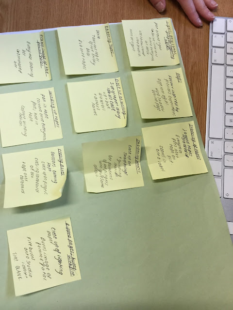


Reflective Comment: me and Chloe are both happy we did these storyboards and although we could've added more of our scenes to the Post-It note written one we had enough that we could follow it and also improvise where necessary.
Friday, 15 January 2016
Character Listing
 Harry Colgan (Our Everyman)
Harry Colgan is one of mine and Chloe's peers. He's a keen actor who thrives off of his drama A-Level lessons. He enjoys the experience of having to work in front of a camera and gets on well with me and Chloe. His character, a psychotic psychic everyman, who records himself speaking about the dream he had the previous night. He feels the need to record these dreams as he sees his future self at significant moments in his life in them. He records these on cassette tapes. Having this reminder of his not so hopeful past has driven him into being mentally unwell and obsessive over how certain things need to be done, for example he feels the need to unwind and rewind tapes. However in our film, Blank, to fit with Film Noir conventions, we have the opening title sequence (OTS) starting at the very end of our film, when our Everyman has experienced his final and most traumatic dream yet - his own death. Here we will see our Everyman at his most crazed and will therefore draw the audience in as more disturbed images will be shown and the pace will be much faster.
 Beth Reid (Our Femme Fatale)
In the OTS the viewer will not see much of our Femme Fatale. There will be a strong suggestion she does not come with good things and that either she will do bad things or bad things will happen to her. This will be through setting alight a picture of here and smoke, a conventional part of Film Noirs, will blow over her. Also to fit with Film Noir traditions I edited the picture of here using an application called Aviary. On this I used the Colour Splash feature so that her red lipstick will in colour and the rest was in black and white. I then played around with the contrasts, brightness and saturation until I was happy with the image. The colour red comes with connotations of stop, blood or danger all of which aren't positive things and again will fig the audience an idea this Femme Fstale isn't to be trusted. The audience, however, from seeing our OTS will not know the Everyman's relationship with the Femme Fatale but as they are the opposite sex and of a similar age the audience should start guessing they are, or once have, been together.
Reflective Comment: Needs finishing
Typography Analysis
For our production me and Chloe will need to include our names, our actor's names and probably a made up team of all the usual job titles that are normally in an opening title sequence. For this we will need to choose our typography for this and also our main titles of what the film is called: Blank. We'll need to choose a font that is relevant to the time period of Film Noirs that we'd be able to see by looking into previous Film Noirs. I am very familiar with Da Font, a catalog of font sets available online for free at dafont.com. On this website we could find the font we want or at least just research through possibilities. Me and Chloe have planned to have our main credits on the labels of cassette tapes, this links to the narrative as our main protagonist records what he saw in his dreams on tapes similar to these. However I have never downloaded a font from Da Font and converted it so it's available to use on iMovie. This will be something I need to research into how to do this. The first slide of this SlideShare is of some examples of Film Noir titles, as you can see they're very varied in fonts but all have in common that they're easy to read and quite thick as if they're bold. The second slide is of the website Da Font and what comes up when you search 'blank'. On the third slide is some possible ideas of what typography we could use, font number 6 and 8 is probably my favourites as they're the thickest and easiest to read. Numbers 2 and 11 are too swirly for Film Noir but probably look the creepiest.
Blank, Blank, Blank, Blank, Blank, Blank, Blank
Blank, Blank, Blank, Blank, Blank, Blank, Blank
Typography ideas for OTS of Film Noir production from Emily Ventress
Reflective Comment: This is the typical Film Noir typography I analysed. I thought this would be useful when Chloe comes to making the titles, when I make the ident and when we both come to making the credits. Although there isn't many fonts to choose from on Blogger I showed more in the Slideshare and also how they are quite accessible via programs such as DaFont.com. However after writing this I attempted to download one of these fonts and it is quite difficult via an Apple Mac computer and I am yet to discover how to get them on iMovie. I also realise how on page 3 of the Slideshare that fonts 6, 7, 8, 9, 10 and 11 do not show. I don't know why this is but after trying twice to get them to show it isn't working.
Me and Chloe have now tested many different fonts and have gone with a scratched looking effect to fit with our Neo Noir horror theme. We based these partly on a trailer Chloe Smith had recently seen and told me about. It's off of the trailer for The Purge 3: Election Year | Official US Trailer (2016). We liked these as they flicker before becoming apparent what it says, this makes the audience feel uncomfortable as the text is distorted and then you see for a split second what it really says.
Titles Ideas from Emily Ventress
The first one we felt was too light and contrasted too much with our footage. The second I had made where I put the text on a document in white with a back background then screen shotted these after moving them, I put them on iMovie for 0.2 seconds each, but these are too slow moving and not creepy enough. The third one is actually out of our final piece as we liked this one. These were made by Chloe scratching paper with a compass, going over it in pencil and silver pen all on black paper and taking a picture of it. I then made the background darker using the colour levels on iMovie and put it at 0.1 second. I then removed the background of these using Photoshop and moved it slightly, repeated this about 9 times into the pattern I liked, saved all these picture separately then put them all 0.1 second after another. I really liked this effect and we continued it throughout our credits. However we realised we'd need one of the names to have a job role of director as that is conventional for the main credits in an opening title sequence.
The first one we felt was too light and contrasted too much with our footage. The second I had made where I put the text on a document in white with a back background then screen shotted these after moving them, I put them on iMovie for 0.2 seconds each, but these are too slow moving and not creepy enough. The third one is actually out of our final piece as we liked this one. These were made by Chloe scratching paper with a compass, going over it in pencil and silver pen all on black paper and taking a picture of it. I then made the background darker using the colour levels on iMovie and put it at 0.1 second. I then removed the background of these using Photoshop and moved it slightly, repeated this about 9 times into the pattern I liked, saved all these picture separately then put them all 0.1 second after another. I really liked this effect and we continued it throughout our credits. However we realised we'd need one of the names to have a job role of director as that is conventional for the main credits in an opening title sequence.
Sunday, 10 January 2016
Experimenting with camera angles, filters, music, speed etc. of clips we could use
These are possible camera angles, filters etc. we could use for our clips of our tapes and also if our main protagonist does write something. These were just a play around on my iPad on iMovie and also to show Chloe Smith how to use iMovie a little bit in preparation for our editing.
Reflective Comment: This was mainly to show Chloe how to use iMovie in preparation for our editing of our final production. I like how we showed what we could use and also how we experimented with nearly ever tool on iMovie, it gave a good incite into what we want to try and what we could do when it comes to filming.
Subscribe to:
Posts (Atom)